Showing posts with label design. Show all posts

Monday, October 24, 2011

Alphabet Project Final Poster

Time has run away with me. Remember the Alphabet Project that I started way back, the one where I posted three new letters every month or so? No? Well, I don't blame you; it's my fault. I dropped the ball with only a few letters left. I finished the project on time, but I didn't finish sharing it, and I apologize—will you forgive me? Yes? Ah, things are looking up already.

In short, the Alphabet Project had only one rule: no going back. Once I decided a letter was "finished" and moved on, I didn't allow myself to fix up old work. This forced me to keep moving, although I did take extra long on a couple of letters, especially "U." It took three weeks and I still don't love it. That's okay, though; we can't love everything.

When I put the finishing touches on the poster and stepped back, I didn't like it at all. It looked terrible. At first I couldn't put my finger on the problem; was it simply shitty design (a total possibility)? Eventually, after a few beers and tears, I tried setting all the letters in 3 colors. Solution discovered. (Not to say shitty design doesn't rear it's head anyway...)

Below is the final result. I started nearly a year and a half ago, so, looking back, there are some things I'm not so proud of. Such is life. Without further babblejabber, the alphabet poster:


The Alphabet Project

And yeah, "K" and "L" swapped positions. Don't tell anyone.

Saturday, March 26, 2011

Time Warner Cable's Hypno-logo

Three plump men are sitting at the far end of an unnecessarily long boardroom table. A lone figure sits across from them, unapologetically sporting an unbuttoned collar and no tie. The men squint across the ruby surface waiting for the lone figure to begin. He has three packets in front of him, each containing a different logo concept for their company, Time Warner Cable. The man is Steff Geissbuhler, the designer responsible for the NBC peacock logo. 

Steff hands the first packet to a fourth man, an up-and-coming Plumpy whose presence is charged with one task: acting as messenger between the two sides of the table. In his eyes, the first logo concept is the winner; it's elegant, sharp, clever, and perfect for the target audience. 

The distant men barely look at it.

"Too difficult to understand," one Plumpy says. 

"I agree," says another. 

The third nods. "We don't want to confuse anyone."

Steff clicks his pen and sits up straight. His pushes his glasses to the bridge of his nose, even though they're already up as high as they go. Seth hands Plumpy Jr. another packet. The second logo isn't brilliant, but it's solid. He toned down the cleverness, approached the problem literally. 

The three men look glance at the packet. "Too obvious."

"It almost seems childish."

"I could come up with this."

Steff presses his feet into the floor. His face flushes slightly, he can feel himself getting warm. He becomes aware of his breathing. 

He passes along the third logo, already knowing they won't like it. It's impossible, because the idea behind the logo is borderline 1984 Big Brother material. He had trouble coming up with a solid design after the first two, so he went and made a logo that he though represented the reality of the situation: a hypnotizing spiral emanating from the center of an eye. Television is hypnotic garbage, and Time Warner Cable are counter trash-men, delivering the garbage instead of picking it up.

The tree men stare at the logo for a long time. They whisper back and forth. Finally, one speaks.

"Brilliant."


Okay, this probably isn't how it went down, but I'd like to think that Seth isn't responsible for the overtly obnoxious logo above. I admit—I know not all business men are plump, nor are all designers comrades in the fight for humane design. Still, it's hard for me to accept being associated with the kind of insensitive thinker that would come up with a logo like this.

Harsh, you say? Perhaps. But let's think about it. Let's try to step outside the realm of the familiar and objectively look at it. The logo is comprised of two elements. 1) An eye, and 2) a spiral, which is a commonly used symbol for hypnosis. (Don't take my word for it, just google image search "hypnotic" or "hypnosis.")

Now try disassociating "Time Warner Cable" with the logo; let it sit in front of your eyes independently of any linguistic label. With these two elements, the eye and spiral, the logo seems to represent some kind of evil mind-controlling empire hell bent on hypnotizing the masses. And, well, it pretty much is. Yet no one cares.

Wednesday, January 12, 2011

Alphabet Project: STU

Snow, lots of it. I had all the time in the world, it seemed, since I couldn't go anywhere or do anything but watch TV and eat. After a few movies and sandwiches I nestled into the couch, laptop in hand, and played with shapes and colors as the snow blew at the sliding doors. The snowdust waves shuffled in and out of sight, intermittently mesmerizing me as I looked up to think.

It's amazing what can be done when there's nothing else to do. As motivated as I try to get myself to hunker down and work, two feet of snow is king compared to my will. A number of times I put the laptop down, stood up, thought about what else I could do, then sat down and kept going. I probably looked pretty silly if someone were looking through the window. That's okay.

So here you go: an S that bloomed from an accident; a T that reminds me of these little water creatures we had in 5th grade science; and a U that makes me say "Yarr."


Tuesday, December 21, 2010

Alphabet Project: PQR

More letters! As I go through the process of repeatedly attacking the same problem I begin to realize personal tendencies/preferences, such as slight ambiguity and attempted elegance. 

I say slight ambiguity because I'm not really sure how these latest set of letters will be perceived. Is the P obvious? Do you see what I'm going for with the Q? Is the R weighted so that it doesn't look like a swirly-do of line?

I call it attempted elegance because I'm not sure how else to describe it. These last three letters seem like part of a set, perhaps because they're all single color flat black graphics. Stylistically I think they're still unique enough to stand alone on their own; the negative space aspect of the P, the illustrative quality of the Q, the fluidity of the R.

Through the project I end up finding out what I like and don't like as well as what I can and can't do. The latter is important because it reveals my boundaries. Hitting roadblocks in technical skill is frustrating, but phenomenally rewarding. When I can't achieve what I'm trying to do I end up Googling/Experimenting until I figure it out; sometimes I get distracted by a new path that reveals itself and I never look back. I think it's also important to appreciate the unexpected. Some people call them mistakes, others call them surprises.

Thanks for reading.


Friday, December 10, 2010

Alphabet Project: MNO

Greetings, readers. As my grandfather used to often say, "Another day, another way." I think he managed to live up to it, enjoying 9 decades of living and going out for a long walk every day, at least until his body finally stopped him. So here we are, another day, another piece of writing, a few more letters, a story (albeit short); all consumed in the infinite digital membrane we call the internet.

Can you imagine me, sitting at my tiny pockmarked wooden desk, butt snuggling the cold plastic chair? Try to picture it. The internet decomposes intent, what we have left is the residue of human interaction, but no, no interaction. I can't whatsoever picture you, dear reader, as you go through my posts. Perhaps there's no one reading this, thus no "you", or maybe, in that case, the "you" is really me. Where am I going with this? Do I need to go anywhere?

Well, for sanity's sake, I'll go here: Below are the next set of letters in the Alphabet Project. A few nights ago a friend, having read my previous project posts, pointed out that I'm being too hard on myself, too negative, even. I can't say I disagree, but I wonder the merits of such an outlook. In doing so, am I justifying my negativity? Likely. (I just called myself out.)

However, recently I've been digging deeply into the dichotomy of right/wrong, often depicted by the diorama of white/black. We all love hearing clear answers; solutions that say this or that. But why not both and neither, all at the same time? Shades of gray - we've all heard it. Can I beat myself up and prosper? Am I sacrificing myself for myself?


Saturday, December 4, 2010

Milton Glaser from Drawing is Thinking

I recently received Milton Glaser's Drawing is Thinking as a gift and immediately began reading it. Interestingly, there's not much reading to be had, at least not prosaically (instead: visually). The book starts off with a short introduction by Judith Thurman, then continues with a 13 page Glaser interview by Peter Mayer. After that, there's no words until the index.

Glaser designed the book to be a visual experience uninfluenced by text. In the interview he compares the experience to listening to a good piece of music:

"My intention in creating this book was to fashion a kind of musical experience, one in which each image anticipates what is to come and relates to what has appeared before, much as a melodic line does. I am hoping to achieve a non-descriptive experience." (10).

And, sticking to his claim, there is page after page of beautiful, undescribed artwork. Not knowing for who or what the work was produced allows the viewer to better appreciate each as an independent piece, rather than a supplement to a design.

Although the book is about drawing, Glaser touches on design during the interview. As an aspiring graphic designer this snippet rings deep, and I'd like to share.

Peter Mayer: What do you want to achieve, in having created this work? The images in it are not new, but the book itself is a totally new work. If the book is an aggregate of the images and their sequencing, then one might ask the question: Who is this sequence for? We agreed early on that this would be a very personal book. Is this a book that you see as for yourself?

Milton Glaser: You know, every time I speak to students, they always ask, "Do you do any work for yourself?" The presumption beneath that question is that since one works to assignment, the work is not for oneself. My view is that all the work I've done is for myself, and it also involves accommodating either a personality (the client) or problem that has to be solved. Such is the nature of the design profession. 

My work is always for an audience because I want people to see it. But, here, what I want them to see is something other than a series of solutions to individual problems. .... I get closer here to my attempt to create attentiveness than in any single work that I've done. I have always been aware of the need to provoke the mind when communicating ideas because that is the only way that you prod someone into understanding anything. That is why ambiguity is such a useful tool. (12-13)

Beautiful.

Tuesday, November 30, 2010

Alphabet Project: JKL

"No turning back" is a motto I almost wish I hadn't employed for this project. Preparing to post the letters now, after several months, I find myself wanting to make adjustments and play some more. I explicitly made it a rule not to, so here I am with more work that I find underwhelming.

There's a great lesson to be had here, although a tough one to accept: we will never be satisfied. I guess that's not really a lesson, but an observation. We have to make it into a lesson by taking the time to really think about the implications of such an idea. If I'm never satisfied, how do I know when to move on to the next piece, and how should I feel about wanting to go back to previously "finished" pieces and tampering with them further?

If you think this sounds a lot like the last Alphabet Project post, you're right. I've always believed that knowing the Question is half the battle, but that doesn't make searching for Answers any easier. This is starting to sound like a sermon, so I'll stop at that.


Thursday, November 18, 2010

A Letter to the Grid

Dear Grid,

I realized something extraordinary as of late. I don't care about you anymore. Please don't take this personally. It's not you, it's me. Maybe we can be friends?

We had a good run, but it's time for me to move on. During our time together I learned a lot from you, I appreciate what you've done for my mind and art, but the days of confinement are over.

I remember the first time we met. There were a few elements askew on a poster I was designing and my friend told me to line them up. "Put them on the grid," she said. And just like that, our relationship began.


Example grids


You and your system of alignments wooed me that day, keeping my information structured and providing organization that supposedly facilitates readability and understanding. What you really did was control me, inviting me to be a part of the "system" just like everyone else.


Example of poster using a grid


My creativity flourished for a while, I'll give you that, but then it waned and puttered out. There's only so much that can be done in the confines of your two dimensional prison cell. I struggled, squirmed, screamed to be released. Then one day I realized the key was in my pocket the whole time:

You are not the rule, merely a tool.

Example of breaking from the grid

You and your lines of confinement may inhibit growth, and I'm through being a layout monogamist.

Sincerely asymmetrical,
Joey Cofone

Friday, October 22, 2010

Alphabet Project: GHI

[Read about the Alphabet Project here.]

I started this project several months ago, in May I think, and I play around whenever I feel inspired to create letterforms. The letters I'm posting now are old, not so much chronologically as psychologically and technically (in relation to my personal development as an image maker), and as I go through them now I feel underwhelmed by work that previously excited me. A challenge to the self: how do I treat these feelings?

Rationally, it makes sense older work isn't as "good" as newer work, but when I think about what I thought was "good" then, it makes me question my definition of "good" now. It's likely that my current work will be lackluster to what I'll be making in several months. There's a positive and negative here.

It's great that I'll be better in the future. Good, good, good; it means I'm consciously making an effort to improve, which is hard to gage over a short time, easier in lengthy chunks. The negative side of the experience is that I question the definition of "good," and ask myself how I can be happy with what I have if what I make later will be "better".  The conundrum.

"Good" loses all objective meaning, then, when there is no limit to how good (or bad) a product can be. That leaves us with the subjective definition of good, which is, because of it's nature, merely relative to other work. And if the others can be infinitely better or worse we're back where we left off.

What do we do, then? How do we view our old work? What do we expect of our new work? It's a lot more fun to have questions than answers, so I'm not going to imagine or wish that there are solid solutions. Instead of judging ourselves let's simply appreciate our old work, understand that each product is a stone in the pavement to the present, and continue to lay stones to the future.


Wednesday, October 13, 2010

Alphabet Project: DEF

[Read about the Alphabet Project here.] 

A couple of weeks ago I started posting the alphabet project I've been working on. (Every day I try to design another letter.) Sometimes I sit down with loads of time and don't make anything I like; other times I mess around for five minutes before I have to go out and I make something I love.

I think there's something to be said for that. Whimsy and playfulness seem to be prime ingredients for positive results. The less pressure to produce a good design the easier it slips out. This is one reason why initial concepts are usually outshined by latter ones.

The more we make the less we feel pressured to make. Design #1 is rough because of the fear (and excitement) that motivates us to succeed. Design #14 plops out of us almost unnoticed. It's like slowly entering the ocean on a cold day. The first step is always the worst, but as we walk it gets easier and easier. Before we know it we're swimming.

Here's D, E, and F.


Friday, October 1, 2010

Alphabet Project: ABC

Sometimes things tend to come back around. I'm not saying that stuff "happens for a reason," because I'm not that type of person; fate isn't an idea I find comforting in the least. Neo (from The Matrix) said it best: "I don't like the idea that I'm not in control of my life." Having said that, "coincidences" are still interesting and sometimes worth talking about because they make good stories.

In the first blog post here on Digital Barf I wrote about the Sketch Adventure outing at Chelsea Markets, where "when all was said and done (and drawn) a couple of us got tasty gelato." What I never mentioned was the spectacular business card I picked up at that little gelato stand.

I've been collecting business cards for a while now. Each one has something that intrigues me. Usually it's a good design, clever layout, sweet color scheme, but every now and then I take business cards that are terrible to remind me what not to do. In this instance, that wasn't the case.

The card I picked up had a beautifully designed logo on the front. It feels old school and modern all at once, something I've been trying to understand and learn. The colors are interesting too; I like how the one bold color and one soft color play off each other so well. My favorite aspect of the card is that it's square (I have a thing for squares).


Jessica Hiche, a popular typographer and graphic designer, visited SVA a few months ago and I was lucky enough to be invited to sit in on her talk. As it turns out, she is the designer of the business card I liked so much! Awesome. She told us all about her obsession with typography and about her ongoing project Daily Drop Cap. It works like this:

Each day (or at least each WORK day), a new hand-crafted decorative initial cap will be posted for your enjoyment and for the beautification of blog posts everywhere.

I thought this was a great idea so I started working through the alphabet, doing a letter whenever I could get a chance or felt the urger. Mine aren't nearly as awesome as Jessica's, but we all have to start somewhere.


----

The rest of the letters:


S, T, and U

Tuesday, September 21, 2010

Discussion by the Lake: A Moment Recreated

I have a bad memory. If you know me personally that's probably an understatement. This week we were challenged to recreate a moment from the summer. I turned to my friends for help since I couldn't remember much. (They're like external hard drives, in a way. Why store memories on my local drive when I can store it on the network? Okay, that's a morbidly modern way to look at the situation, but you get the point.)

After a few beers and a solid reminiscing session I decided that I couldn't decide. Or I defaulted, depending on how you look at it. We had talked about a lot of great moments but none of them were moving me the right way. I needed a memory that I could spend a few hours recreating without wishing I could forget it by the time I was done.

I put off starting the project for a couple of days in hopes that I'd have a eureka moment. That's one of those I-wasn't-thinking-about-it-but-a-great-idea-just-came-to-me things. Luckily, I did. I woke up one morning before my alarm clock went off and had an image of three figures on a bench, each made up of different materials. It was an image of one of the most powerful moments this summer.

The moment was during a camping trip with Jay and Chris. After a hearty day of cooking meal after meal in the woods, stomachs bloated, and with the sun starting to draw long tree shadows across the campsite, we headed over to the lake to sit and talk. We sat on one of those universal wooden park benches right near the edge of the water. It was majestic.

There were two guys were fishing on a boat right in front of us. They moved away after a few minutes, probably out of the awkward way we were forced to stare at them. It was like a weird standoff, the men of the land staring at the men of the sea. It makes me think of Troy and Greece, when the Greek ships were close enough for the soldiers to stare into the eyes of the Trojans but not close enough to get off the ship and attack. A waiting game. Only instead of the fishermen eventually attacking they pulled out their oars and drooped away.

But that has nothing to do with the project. It's all about the bench, three friends, and the differences between who we are and what we do.


From left to right: Jay, me, Chris. During our trip we talked about the different way we each sit. Jay likes to pull one leg up, I usually cross my legs near my ankles, and Chris tends to sit relaxed with one foot out. I didn't put the rest of the bodies because it isn't needed to convey the message.

I made each figure out of materials symbolic to who the person is. Jay is a mechanical engineer, I'm a graphic designer, an Chris is a drummer. Granted the clear tubes don't scream graphic designer (people keep asking me how it relates) so I guess I failed in that sense. I was trying to go for a modern approach; I thought plastic would be a good representation of the modern tool of the computer. I think paper tubes would've been easier to understand and more appropriate. Lesson learned!

The books that make up the bench are by Aldous Huxley (of Brave New World). One is The Island and the other is Point Counter Point. They seem fitting, one about a paradise, one about philosophy and discussion.

So, there you have it. My first venture into symbolic 3D design and photography. See you soon.


Monday, July 26, 2010

My Writing Process, by Dennis Santaniello

[Read about Digital Barf's guest bloggers here.]

PrefaceI had no intention of writing any of this until I came to the realization that the most important thing you can do in life is share. Life’s so short, so precious, so mysterious that creating things is the only way of validating time spent.

I started thinking of the process of my writing. I write because it’s the easiest thing in the world for me. The biggest design pattern I follow is not to get from here to there. That’s not an issue with me. What I’m striving for, on a daily basis, is how to get to the Zone. Not Auto Zone or the Fun Zone. I’m talking about The Absolute, Infallible Zone of Creativity and Bliss. There is nothing more gratifying than to say to somebody, “Not now, Tinky, I’m in the fucking zone!” You know when you’re in the zone because time stops, things come together in new and exciting ways you couldn’t dream of, and your work is…well...working.

The zone is located on the path of righteousness, but it is blocked by the countless Detour signs of the Resistance. [1]

The following is my way of breaking through the Resistance: My design.


Fighting the Resistance

Getting into the zone comes at a price. You must fight a war: the daily, gnawing, agitating war against the Resistance. The Resistance comes in many forms, and it’s kinda like the New York Yankees. Its smug, its presence is all over the fucking place, and it knows it could beat you. The Resistance, put simply, is everything that prevents you from working. From the distracting phone calls, to crying babies on buses, to the miserable jerks who smell like cabbage, to your love ones who smell like Honey Dew, it seems that everyone is playing for the Resistance. But guess what, when you’re not working, you play for it too. And that’s when you lose.

Life always seems to get in the way, but if you want to work well, you’ve got to win. You’ve got to beat the living shit out of this snot nose, suffocating…. Thing. You’ve gotta have a battle plan. That’s where design comes into play. You’ve got to come up with a brilliant, offensive scheme to beat this bastard.


Defeating the Bastard

Good game planning is very important. Writing wise, it’s essential. For me, I take four hours of the day (usually between 6-10 pm) to write. These are four hours of fierce combat. I generally have an objective, sometimes the objectives change and in mid stream I have to adapt to its course. But when I’m engaged to commit myself to get to the zone, I go all out.

My game plan is simple and it’s the same everyday. I sit down. I have an objective of what I want to write and follow these three rules.

1) Be true to the original idea.
There is no substitute to this. What comes out of your head is so hard to put into the physical world, but when it matches and molds into the initial idea you had, you know you have something special. Being true to the original idea is crucial.

2) Listen to your characters
Before I start something, I sit down and my characters talk to me. When I’m writing, particularly when I’m writing dialogue, I’ve got to hear the characters and their problems. Like playing with action figures, I mouth the characters voice and let it out there in open air. It’s something I’ve done ever since I was a kid. Some people may call it schizophrenic. I call it paying attention. I’ve got to hear the intonation of their voice, their pauses, their rhythm, but most importantly their desires.

My characters are doing most of my work. I’m just a court stenographer.

3) Write to Write. Edit to Edit
When I write, I vomit anything and everything that comes to mind. I don’t care if it’s inane, great or mediocre, I spill out everything because I have to. As Hemmingway pointed out, “The first draft of anything is shit.”

Then when the puking is over, I look back to what’s there and I play the hybrid role of both conquistador and janitor, that is the editor. I find the gold and dump the rest. Sometimes there isn’t any gold. Just loads and loads of crap, but that’s not a problem because I’ll just explore another mine by writing another mine.

It took me a long time for me to figure this out but when I finally found it, I knew my foundation was complete. Before learning this, I was very analytical when I wrote ,and I wrote and edit at the same time. This was frustrating and exhausting because it was detrimental to my psyche and slow as hell.

Separating the actions to specific times frees up so much creativity and the zone gets closer and closer. Refining is important, but you must first have something to refine.

That’s my plan. That’s how I write. That’s my design. During college, I found it difficult to write anything but term papers and I felt terrible, but when I came up with the system I knew I had something special, because it got easier and easier to get in the zone, and consequently, my writing got better, ideas flowed like rivers and I got a lot fucking happier with life

They say 3 is a magic number. Well, if there are 3 great players on your basketball team, odds are you’re going to kick some major ass, and in my case when all 3 elements are working in unison, Resistance doesn’t have a chance. The game is won. The Zone is there in all of its orgasmic glory, and it’s like…it’s like an Opera.


The Real Thing to Learn


You are a golden God; not to the world, but to your work, and because you are a God, you must play by your own rules. Relax. Diffuse bullshit. Be scary.


[1] Read Steven Pressfield’s “The War of Art”. Great book. Highly Recommended.

Monday, July 19, 2010

A Strange Wave: My Reaction

A lot can be said in a simple gesture.

Yesterday I was in my building elevator with another person. He was on the phone when I walked in - I think he was talking Korean or Chinese - and it cut out as we headed down. He cursed the phone under his breath and held it up, looking for reception to no avail. I must have been staring, because he turned to me as if I'd said something. So I did.

"Technology, eh?" I huffed (not the deepest comment). Then it was his turn to stare - he looked at me as if I were speaking another language, and that's when I realized I was. I smiled at him and he smiled back. Then the elevator door opened and I was already thinking about where I was heading, our meeting destined to be forgotten, until he caught up and stood in my path.


"Excuse me," he said in semi-broken English. He introduced himself and asked me if I knew of any places to eat around our building. Turns out he just moved in and was starving and completely alone. I started to tell him about the local eateries I fancy but his expression said he was having a hard time following.

"Come with me," I said, and led him outside. We walked a couple of blocks and I pointed out some places, told him what kind of food they had, and how much a good meal was. In between stops he told me that he was a fine artist looking to do computer art and animation. It was difficult to communicate, but we both spoke slowly and managed well enough. After our mini tour we said our goodbyes.

This is where it gets good. When we waved goodbye I did the common American wave in which the elbow is generally near the hip, hand is held up about shoulder height, and the hand moves from side to side once, like a sort of lazy salute. My new friend waved me away completely different. His elbow was head height and his arm arched over his head. He didn't just swipe his hand once like I did, either, but instead waved back and forth like a young wife bidding her sailor husband adieu. I couldn't help but draw a huge smile. His wave seemed so innocent and honest compared to the usual American fare.


The typical American wave, aka the lazy salute.


The one-eyed rabbit exampling the stranger's wave.


As so much was expressed in such a simple gesture, the same can be applied to design. It only takes a slightly adjusted nuance here and there to radically change the mood of a piece of work. All it took was a little raising of the hand by about ten inches and the gesture transcended apathetic detachment to wholehearted sincerity.

Being aware of what we're doing is power unto itself. It's one thing for us to randomly fiddle with colors, type, or layout and get something great, but another thing entirely if the choices we make are intentional and the final product a beautiful blossoming flower of conscious decisions.

So, to the unknowing fellow in the elevator: thank you for reminding me.

Thursday, July 15, 2010

Design on the Streets, by James Mazza

[Read about Digital Barf's guest bloggers here.]

Let me start off by giving everyone a little bit of background about what I do, and then perhaps the rest of what follows will make sense. I am an Emergency Medical Technician in NJ. I work two different jobs as a simple EMT and volunteer my time as a Lieutenant in charge of all EMS and Rescue on Monday nights for a local town. I am also currently studying to be an RN. Now that we know who I am and what I do, let’s get to talking about how my job has absolutely nothing to do with design while having everything to do with design.

Being an EMT is not all “blood and guts” like most people think. In my estimation it is more like 70% psychological, simply being there, 20% real emergencies, heart attacks, allergic reactions, car accidents, etc, 5% absurd situations and 5 % BS. Depending on who you talk to these numbers likely change and for some dramatically; however, this is how I see it.

When we are in training we are taught the very basics, how to talk to people, carry them to the ambulance, provide first aid and oxygen treatments, perform CPR with the hope of saving a life. These skills are given to us with the express understanding that we will need to improvise and adapt to do things. Our template fresh out of school, a “design” if you will, is very basic and will help us to grow but it is only a start. The one thing about emergencies is that there is never two that are alike. There is always something different. There is always a new windy staircase that someone has to be carried down, or a strange way someone fell when they had their heart attack, or the way the steel on the car twisted after an accident makes getting to the people inside harder than it was an accident or two ago. Our “design” needs to be fluid and ever changing because we never know what we will see and as such cannot be set in stone.

Acting as a supervisor, I had an interesting experience recently that had nothing to do with emergency medicine and everything to do with control and design. With the heat wave, something broke in the electrical grid in my area of Jersey during the time I ride as an EMT/Supervisor as a volunteer. With the power out, two six story buildings containing almost all senior citizens, many of whom were handicapped and on oxygen, needed to be evacuated so that the people would be in a cooler environment where they would not be as likely to pass out or succumb to heat exhaustion/stroke. With no working elevators and only very faint emergency lighting, one can imagine how hard this task would be.

Upon arriving on the scene I immediately set to working with the two Police Officers on scene to begin a systematic search of all the floors, first checking on the people on oxygen and then the handicapped and so on. Members of the paid fire department where there, however they were not as helpful as they could have been, leaving it to myself and the two officers to run the whole show. This was the first time I had ever been thrust into such a large situation before and was expected to take charge of it. Sure, I had been here a few years ago when this same event had occurred, however then I was simply muscle to carry people down the stairs. This time I was expected to be calm, cool, in charge, and to get the people to a cooler climate. That’s a lot of responsibility for a 23 year old who isn’t getting paid for his time!

As part of my training I was required to take courses that would prepare me for Incident Command, a term coined after 9/11 as being necessary for all large incidents. This gave me a background of information to build on, although nothing can prepare you for the moment in which you need to draw upon that sort of training for the first time. Further compounding the problems was the fact that the town I volunteer for has the Paid Fire Department in charge of Emergency Management, which this task falls under in a time like this, however the person in charge of FD did not take charge leaving myself and two exemplary Patrolmen to handle the situation. Not until the Volunteer Fire Dept. members arrived did the FD become truly useful to us in this situation.

With guidance from the Police as to which rooms still needed to be searched, I sent the men and women under my command up to the floors to do a search room by room, floor by floor. We designed a search plan and who would take what floor and then we executed the plan. This incident started at about 10:40 at night and wasn’t over until 3 in the morning. While I did not have to physically work like the rest of the people I volunteer with on Monday nights, being in charge caused me a great deal of work to make sure I kept the information right and passed on the right information to the right people. This being the first time I had to operate in a situation like that, and based on the feedback I got from many people who were there telling me I did a fantastic job, I can only say that the design I was given in training must have paid off in a big way because things were handled without incident.

Some may question how being an EMT has anything to do with design, and rightfully so. I hope the above helps to expand the view on what design there can be, particularly when you see an Ambulance flying by you with lights on and siren wailing. More is going on than meets the eye usually and design plays one of the biggest factors.

Wednesday, July 7, 2010

Narrative Design in Filmmaking, by Iker Maidagan

[Read about Digital Barf's guest bloggers here.]

Some time ago, my friend Joey asked me if I’d like to write an article somehow relating design to animation. Back then I had just finished working on a pencil-test sequence for my animation class at SVA, so I could easily use it an example. Easily? Not quite.

The easy thing would be to bore the hell out of everybody by writing a subjective harangue on character design. But that’s just the shortsighted way of understanding design in terms of visual storytelling. Designing a character isn’t even an inherent step within the process of filmmaking. It can be applied to anything from mascots for the FIFA World Cup to LARPing. Therefore, I’m going to talk about editing and storyboarding; or how making choices about angles, shot composition and duration of frames can determine the meaning and set the mood of a movie despite the fact that most people take these things for granted. Because that is what designing a film is all about in the end.


Take a look at the sequence above. Nothing too fancy, we didn’t even have time to add some backgrounds and polish a few animations. There isn’t much of a story either; just two kids playing cowboys and Indians. Yet nothing is there by accident. That sequence is a minute long series of choices.
Think about the way it starts, a sudden cut that comes out of nowhere. Many movies have that sort of opening, like Oldboy or Close Encounters of the Third Kind. It takes you right into the action and works especially well if your scene depicts something very dramatic or physically intense. It’s unexpected, it takes the audience off-guard, so they have to process the information really quickly. With Cowkids, we wanted to exaggerate everything about our main characters’ game, so a blunt opening was the way to go.

We also chose to start the movie with a traditional hip-level shot of our character’s hand reaching for his gun to establish that we were about to witness a duel. From there, a series of mirrored shots emphasize even more this particular scenario at the same time they present our characters. One thing we realized when going for the mirrored shots formula is that the girl would have to be a leftie if we wanted to repeat the first shot from a reverse angle. Directors like Sergio Leone avoided this problem on classics like The Good, The Bad and the Ugly by filming the gunbelt from the front. However, we wanted to keep both characters on frame, so the leftie choice won over new camera angle option.

Soon, both characters get separated and we show them performing ridiculous acrobatics. First, we see the boy jumping and rolling. Second, we see the girl completing a full circle on a swing before brandishing her weapon. And lastly, both run around the playground to avoid each other. By doing this we accomplish two goals: we hint that the girl is better than the boy, as her dodging tactics are more spectacular and creative. The audience will probably want her to win after that and, in fact, she does win the fight in the end. The second goal is to establish the playground as the setting, which is merely suggested at first and eventually confirmed with a wide shot of both characters running in circles within a limited space.

Later on, the boy tries to top the girl’s latest move by going down a slide to surprise her. She answers by jumping on a merry-go-round to become a moving target. We decided to show how close the boy was from actually hitting the girl by drawing her feet in the foreground, framing the figure of the boy as he opens fire. This is another traditional composition that you can find, although fitting entirely different situations, in movies like To Catch a Thief or Raiders of the Lost Ark.

The slow motion simulated during the merry-go-round sequence emphasizes the girl’s advantage at this point, focusing on how she pulls out her pistol to deliver what may be the final shot. Slow motion can work in two ways: it draws attention and gives the moment a certain degree of magnificence. However, it only works if used scarcely, otherwise it becomes vulgar and redundant. For that reason we made sure it was seen just that one time.

Zoom ins and outs normally are a disgusting choice in live-action, but for some reason, they work just fine in animation. We used them a couple of times to emulate the more elegant tracking shots, most notably in the scene with the boy running towards the bouncing pony. Here, first we show the boy running alone and then we zoom out to reveal the pony. This gives some motion to the shot, something necessary to keep the pace in an action piece, while avoiding excessive cutting, which tends to be confusing.

The tire swing jump and collision between the two characters is something that evolved through time. Originally it was going to be shown in one shot, again, to avoid too many cuts. Unfortunately, the complexity of such shot proved to be too time consuming and it had to be divided into three. Even though the result looks fine in terms of animation, this was one of our most frustrating decisions because in the final movie is hard to tell that the girl loses her gun in the clash. That particular piece of information was relevant because it set up the outcome of the fight, when the girl is briefly at the mercy of the boy right before getting miraculously saved by the Indian toddler.

In terms of choices, the final destiny of the boy had more to do with sound than angles, composition or elaborate animations. We wanted him to fall in a dog park and make it look as if he was being eaten alive by the animals without showing it. Therefore, we just animated a few dogs pouncing over the fence and then played around with sound. As with the rest of the movie, the goal was to exaggerate, so instead of some recording of actual dog barks we resorted to Jaguars roaring. That way, our dogs sounded fierce enough and anyone would think that the poor kid never made it alive after his villainies.

As a closing note, I apologize if anyone thought that this post had nothing to do with design and felt misled. However, I still think that design is a very broad term and professionals from many fields use it in very different ways. Would a car designer think in the way a company logo designer thinks? And what about a videogame designer? What I offered here is what I see as the way filmmakers think whenever they face the challenge of designing a motion picture, no matter how big or small.

Guest Bloggers: Insight Into Design

Design is ubiquitous. From brushing our teeth to organizing our lives design plays a role in every process we partake in, and I'm fascinated by the different approaches people have for the things they do. Some of us approach tasks head on, while others are extremely analytical, and still others are an interesting mixture of both. Ultimately, a good piece of art, recipe, product, photo, or anything else we produce is defined by the string of decisions by the creator that led to the final product.

In my discussions one thing has become clear: our outlook on what we do, the method we approach tasks, and the systems we employ (physically and psychologically) directly affect our results and determine our success. Essentially, we succeed or fail before we even start.

I'm happy to introduce guest posts to Digital Barf. I've selected a few friends whom I truly admire for one reason or another and invited them to give us insight into their own process. Part of the email went something like this:

"While none of you are graphic designers, you're all creative in your own fields. This includes writing, cooking, music, drawing, painting, photography, teaching, engineering, business, and being an emergency medical technician. [What you write] can be about your process, a story you'd like to share, or anything else you feel relates to design. In a nutshell, I'd like for you to share your interpretation of design as applied to your field."

I'm excited to see what they come up with, and I hope you'll find their ideas as interesting as I do.

----

Guest Posts:

Narrative Design in Filmmaking, by Iker Maidagan

Design on the Streets, by James Mazza

My Writing Process, by Dennis Santaniello

Tuesday, June 8, 2010

Popular vs. Personal Opinion: Who Am I?

"Who am I" sounds dramatic, but when popular opinion regarding my work differs from my personal opinion I find myself asking that very question. Am I the guy who thinks his shit doesn't smell, whose artwork's obnoxiousness is only second to his personality's; or am I the guy who thinks his work is terrible and the only way to improve it is to get outside opinion? The more important question is, does a balance between both exist - and if so, can I find it?

Balance is crucial because under-confidence is as poisonous as over-confidence: be under-confident and I may sell myself short or never reach higher levels; and over-confident, well, then I'd just be a prick with underwhelming work. I need to find middle-confidence - a perspective that allows me to be me while still regarding opinions fairly.

It sounds simple, and it is, but it isn't easy. More often than not I defer to my peers for their opinons. It's like I'm looking for some kind of validation, for someone to say, "Yes. Good. That's right," as if there were a definite answer. A definite answer! To art, of all things!

Art is the most subjective form of communication and expression, yet for some reason I often feel the need to compare my subjective understanding against another's. Is there a time and place for opinion? Short answer: yes. Long answer: hell yes. As long as I keep in mind who I am and what I represent, I'm in like lint (in a bellybutton).

I feel like a compressed mattress in a paper bag, a sensation of roiling springlike energy pressing with all it's muscle against the thin walls of everyday life. Something's out there, but I can only see faint light coming through the bag, like I'm hanging on the wall in Plato's cave and only the silhouettes of reality make an imprint on my existence.

On one foot (that's right, foot - hands get enough respect) it's maddening, but on the other it's magnificent. If the men from the cave were ever released they'd appreciate life much more than anyone born into the world the men were deprived of. In the same way, I feel like I'm slowly ripping through that paper bag, catching glimpses of the beautiful inanity of life that literally make me smile and laugh as I walk down the city streets.

Just be yourself.

*rip*

Last fall I put together a small and simple piece that I fell in love with. No one liked it. Here it is.


Sunday, May 23, 2010

Naked Eye Image: Poster for Don Hill's Show

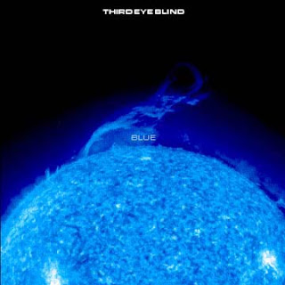
Growing up I was never really into music. Come to think of it, I can't even remember if we had a radio. (Seriously.) The only music I heard was the stuff on TV commercials and oldies over the radio while sitting in the back of my grandmother's Cadillac. Blue, by Third Eye Blind, was the first album I ever owned and I still remember exactly what the cover art looked like. I was 14 when I got it, so it pretty much became the soundtrack to my adventures through puberty.

The first album I ever owned.

Musically, a couple of things have changed in my life since I got my first album. Now I'm teaching myself to play the guitar (slow and steady) and making posters for the NYC band, Naked Eye Image. Okay, so maybe the latter isn't technically music, but it's definitely my favorite part about my involvement in the musical world.

Naked Eye Image plays heady tunes that sound like a cross between Radiohead and Coldplay. They could probably give you a much better estimate of who they sound like so I'm just going to stop at that. You can check out their music and contact the band through their myspace.

Getting a chance to visually explore NEI's musical concepts was a treat. Usually I'm trying to figure out how best to visually represent a business or an individual's ideas, but with NEI I'm one artist attempting to convey the ideas of other artists. I'm not going to lie; making this poster was difficult. I kept thinking about all the nuances, emotions, and ideas behind the music and wondering how the hell to put a face to it. (Never mind the fact that I still had to try and figure out what the "message" is.) The band invited me to their studio for a few hours to hang out in order to help me get a feel for who they are, and we had a great time listening to music and looking at scores of album covers that they like.

In the end I think I put something together that begins to introduce their deep emotional innards to the world. Hopefully I'll get a chance to do it again.


NEI poster. Look closely at the pieces of paper.


Check 'em out: http://www.myspace.com/nakedeyeimage. I hope to see you at the show!

Until next time.

Saturday, May 8, 2010

Crate Chair: The Final Product

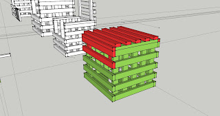
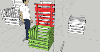
In March I wrote about the Crate Chair I was designing: "We just started working in sculpture class on our final projects made of wood. I've always wanted to make a chair and I thought this would be a great opportunity to do it. Objects that have more than one use pique my interest so I'm making a chair that has more than one function. In short, it's a storage container that transforms between a chair and a small table.

My obsession with squares and cubes led me to doodle a crate that opens up into a chair. I researched simple crate designs and recreated them in 3D. Once I had all the pieces together I began figuring out how I could manipulate them in order for it to open."


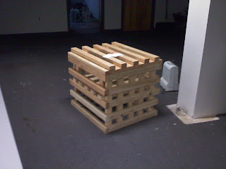
Closed Crate Chair. AKA small table mode.


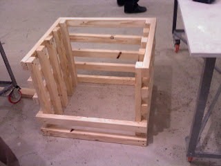
Open Crate Chair with the closed phase on the right.


Image from my progress update in March.


I have good news and bad news. Since I can't ask you which you want to hear first, I'll start with the bad news: I lost the Crate Chair. The good news is that I finished and took pictures before I lost it. Let me explain.

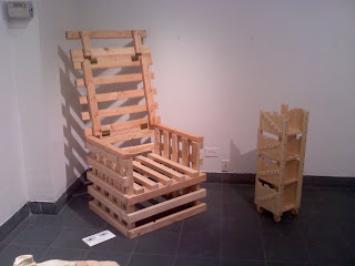
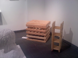
The chair was actually in a sculpture show here at SVA despite the fact that it's more aptly categorized as industrial design than sculpture. Clay heads bursting with all sorts of oddities and plaster freakiness filled the room that my chair sat in. When people reached it after walking around they usually seemed a little confused as to why it was even there. (I confess, I stood in the corner and watched. Wouldn't you?) Because it was different, however, it garnered more attention that it would've in a room full of chairs.

So how did I lose it? In a nutshell, I didn't pick it up after the exhibition ended and the clean-up crew threw it out. Am I sad? A bit, but I what's done is done and the real fun was the designing and building of the chair, not the staring at it.

Unfortunately, because of my blunder, the only pictures I have are cell phone pictures.


The chair just after I finished it. Closed up and ready to go.


At the exhibition.

Open in all its glory. The seat lifts for storage underneath.


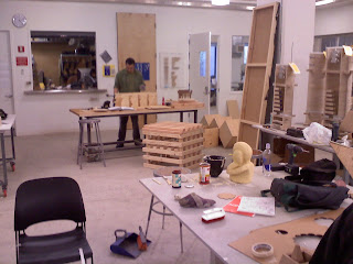
For scale, the chair in the wood shop.


Thanks for reading and I hope you enjoyed the pictures! If you ever come across my missing chair tell it I said hello.